· Shenzhen Next Star Technology Co.,Ltd, founded in 2009, is a high-tech enterprise specialized in R&D,manufacturing and selling IPTV, SoundBar, smart Projector and peripheral intelligent products. Next-Star’s R&D base is located in the whole 8th floor, Baojie’an Trading Center,Shenzhen; Shifeng International Building, Chaoyang North Rd., Daxing Distric, Beijing; and Ace High -End Tower 3, Gasan-Dong 371-50, Geumcheon-Gu,Seoul, Korea.Next-Star has three processing plants which are located at Shiyan,Shenzhen, Huizhou and Dongguan; and respectively manufacture smart set-top boxes, projection, smart SoundBar and peripheral intelligent products.
· Unswervingly based on scientific and technological innovation, product technology research and development with great concentration,and pay attention to product quality and good faith service, Next-Star brought together a group of professional and technical fields of talents, has four independent R&D brands (NEXTSTAR, ipremium,Topfree, AZfox) at present and is cooperating with world famous brands (ZTE,Mundi, NTC, BENJAMIN,AVOV, Probox...).
· "Based on innovation, focus on quality, good faith service, sincere cooperation and common development" is Next-Star’s constant pursuit; for customers to provide high-quality, safe, reliable products are always the policy of company; we will constantly surpass ourselves and create value for customers as always to provide more high-quality technology, products and service.
根据对耐斯拓的了解,我做了以下规划:
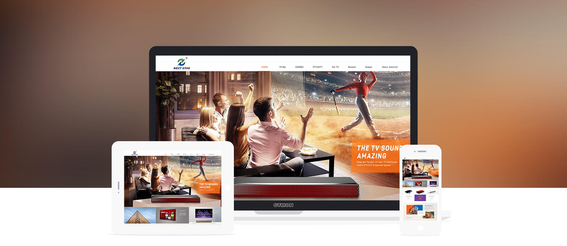
首页展示就像一个电影的预告片一样,不能把所有的故事情节都说清楚,但是可以把主题说清楚!所以我根据栏目图和资料做了下整理,耐斯拓主要以智能机顶盒产品为主,主要应用在电视上面,装了这个机顶盒之后可以有更多的电视节目和音质效果等。
所以板块大致为:1.表达产品应用,2.我们还做哪些产品? 3.产品的优势 4.联系我们
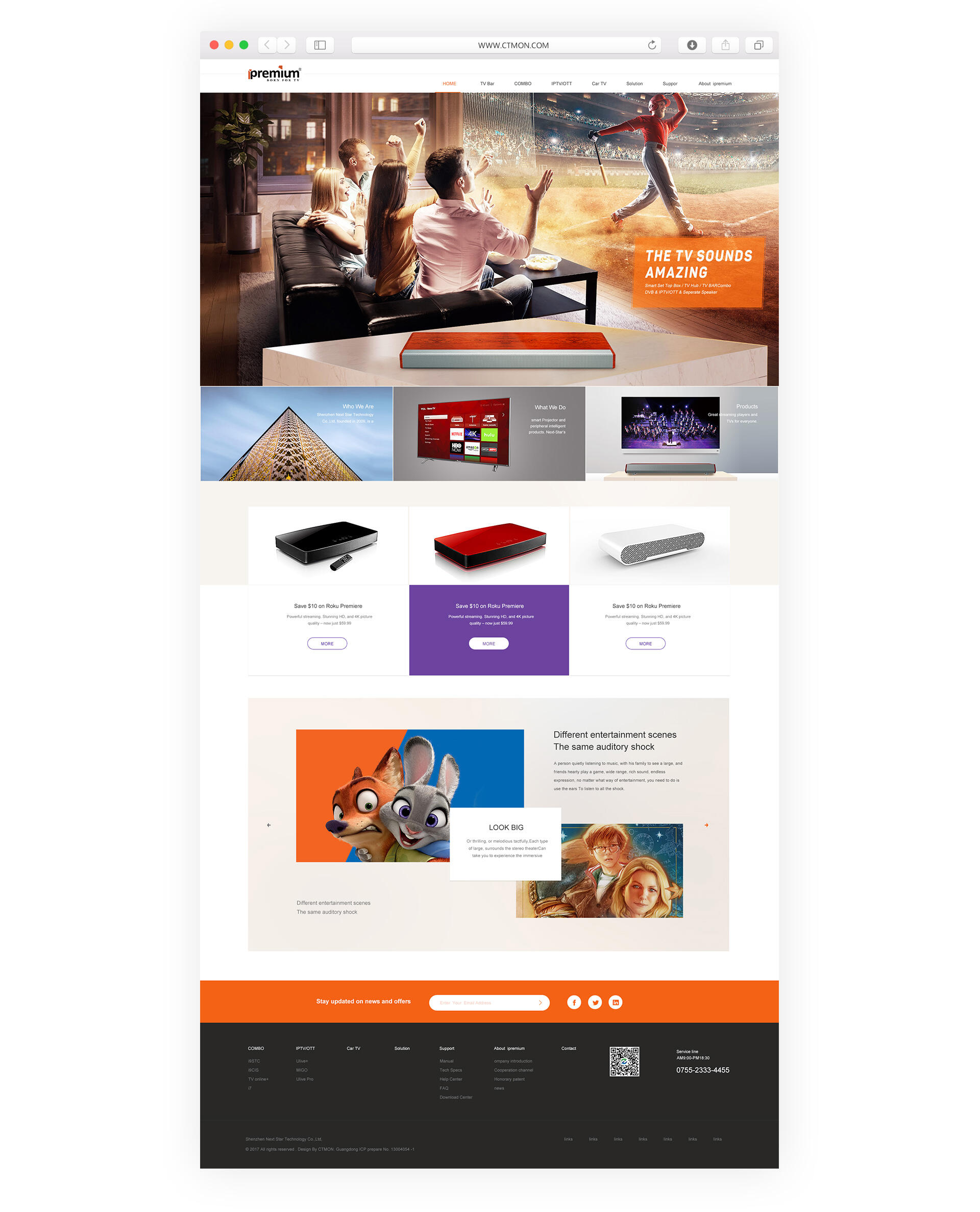
第一张图主要想告诉用户我们是做什么产品,用在哪里,所以是以产品的使用场景为主;
场景为欢快的气氛,图为一群年轻人在看电视,十分投入跟享受!之所以没有把电视机画出来,是想突破一下常规,传达出感觉像在影院观影一样的感受,用人物场景表达更加有代入感,用户在看这张图的时候好像自己在其中体验一样,那如此吸引人的电视和节目又好像在影院一样感受,是有什么特殊原因呢?这时候就会看到我们的产品,因为有用到我们的智能机顶盒产品,从而凸显出我们的产品!以及应用的优势。
第二屏是带着用户的思考去看下面三块内容:1.我们是谁? 2.我们做什么? 3.我们的主营产品是什么?
用户第一眼被海报吸引后肯定会继续往下了解,会想我们是谁,我们主要做什么,我们还做什么等等问题;
第三屏主要是推荐产品可以看到不同的分类产品,这就解答了用户心里(我们还做什么?)
第四屏主要是表现产品的优势:电视盒子可以看大片,可以在线玩游戏,可以...; 所以第四屏是可以左右切换,每切换一个换一个优势!
第五屏就是底部导航了,如果用户对我们产品有需要就可以填写邮箱提交给我们,或者电话联系我们,但是国外一般会使用邮件比较多所以邮箱位置更加凸显!
整体颜色搭配:白色打底,橙色辅助,紫色点缀; 鲜亮有活力更容易和年轻人拉近距离,这也是从我们产品的使用群体去考虑的;
排版:排版以整洁为主,在小点缀方面用了斜角对称,这也是从我们logo获得的灵感,logo是左右对称的,有一点像右上角倾斜有中运动感!所以海报图上面的文字用了一点向上倾斜作为点缀,优势板块用了左右对称作为点缀!这样可以起到收尾呼应!
整体调性:图片处理为欧美大片的风格,这跟我们的产品应用更加接近,同时品牌感提升!色调一致会更加舒适耐看。
Copyright ©深圳市创同盟科技有限公司 2013-2021 ALL Rights Reserved 版权 网站地图
 粤公网安备 44030602002431号 粤ICP备13075754号